chase zalewski is easily up there as one of my favorite photographers of all time (along with ella weisskamp and allin skiba) due to his attention to detail and use of color. I like that all of his images look like a memory, and are taken with such precision that it somehow manages to capture a decisive moment.
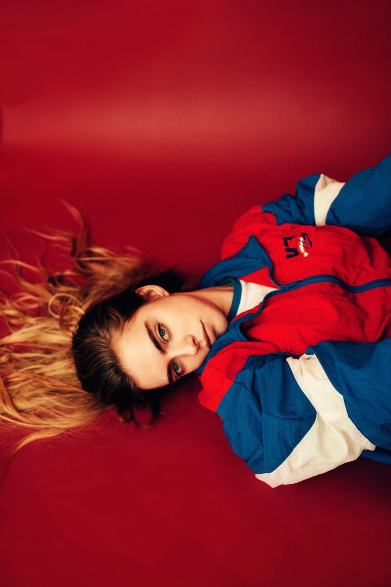
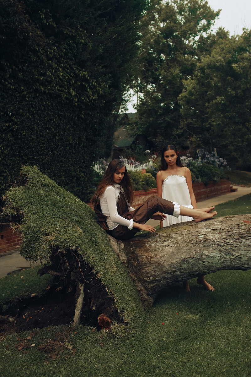
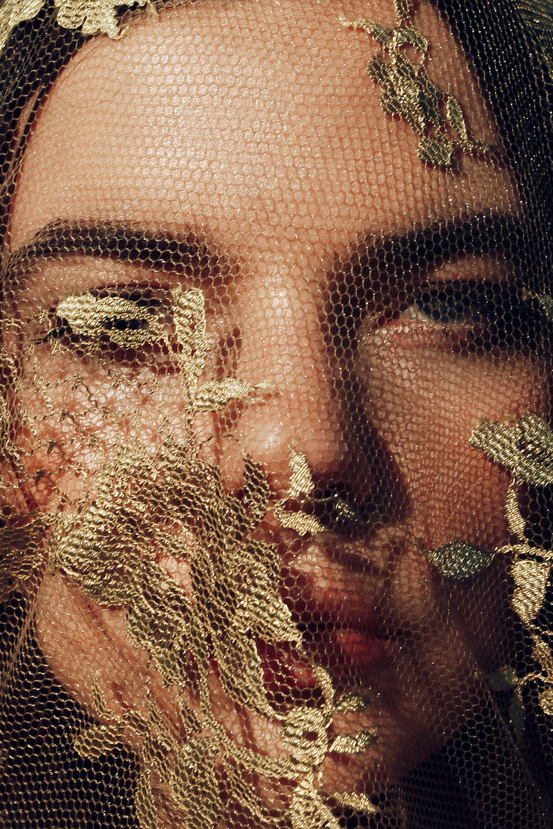
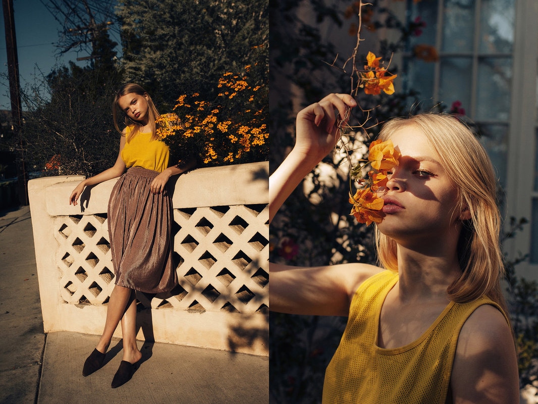
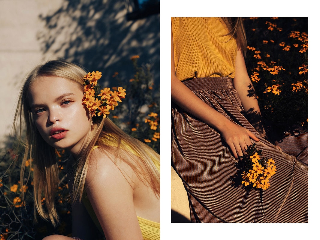
the red photo at the top left is from a shoot with model Marta. the pairing of her stern, brooding look and the bold red and blue colors of the photo add mood and depth to the photograph. he fills the frame expertly and uniquely with her position on the floor, and all lines of her jacket lead to her face and hair, creating a strong focal point. the highlight in the red background adds value to the photograph, expressing the idea that she is on the floor and not suspended in red space. the middle photograph of the two girls was shot with models Olivia and Madeline Magruder. Again, he uses facial expression and body placement to add mood to the photograph. the earthy tones add a naturalistic feel to the picture and the placement of the tree and shrub add leading lines as helpers in the unity of the photograph. the subtle pops of brown and white color add movement of the eye around the composition and it all flows as a color scheme very well. the top right picture was from a small shoot with Alina Aliluykina. what really brings this photograph together is his attention to detail throughout the composition. from the placement of the lace, embroidered netting to the attention to color and mood, he creates a very simple photo with complex detail. the simple variation in the photograph adds a lot of movement throughout the composition, and the color continuity unifies all of the emphases. the entirety of the bottom row is from my favorite editorial So It Goes by Zalewski for Cake Magazine, with freedom model Nastya Siten. this is my favorite series mostly because of composition and color continuity. i love the use of flowers as a prop (huge inspo!) and Nastya's expression/glowy features throughout the shoot, not to mention the lighting is amazing. the light used is obviously ambient with a rich amber hue to it, which helps the color continuity and mood. i also really like the speckled light in the middle two photograph because it adds complexity and unifies the picture together.
0 Comments
Lighting Example 46: Dramatic LightingExample on Website: 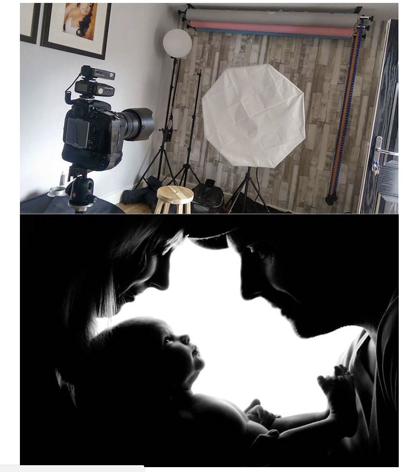 Our Attempts: 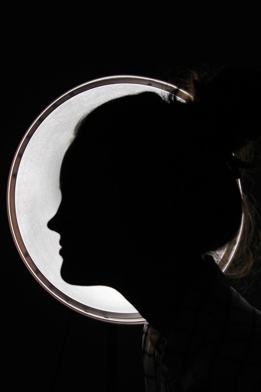 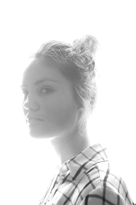 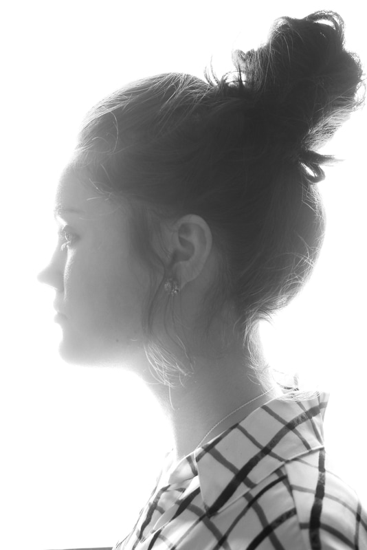 process of this image: this lighting example was quite challenging for us in terms of finding the correct materials and room for setup. the first two images on the right were as close as we could get to the proper set up we saw in the picture, but the outcome was, while not unsatisfactory, did not complete the task, so we had to start over. the photo on the left was an improvisation thought of by chloe. we had maddie stand in front of the light and we shot directly into the light using a low shutter speed to capture a silhouette. the only problem is that the light isn't as large as we wanted, so there's empty space surrounding the light, but it's closer to fulfilling the prompt than the first attempt. Lighting Example 17: Colored LightsExample on Website: 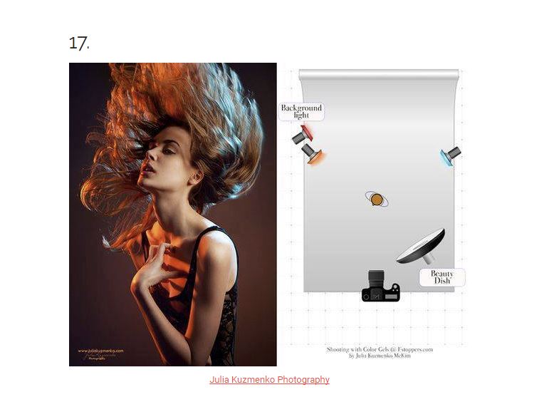 Our Attempts: 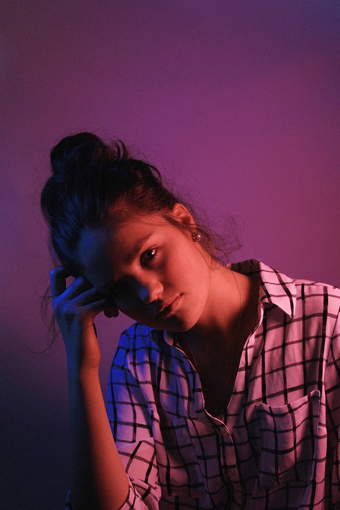 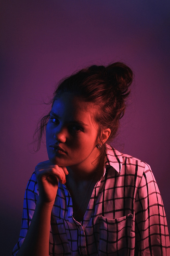 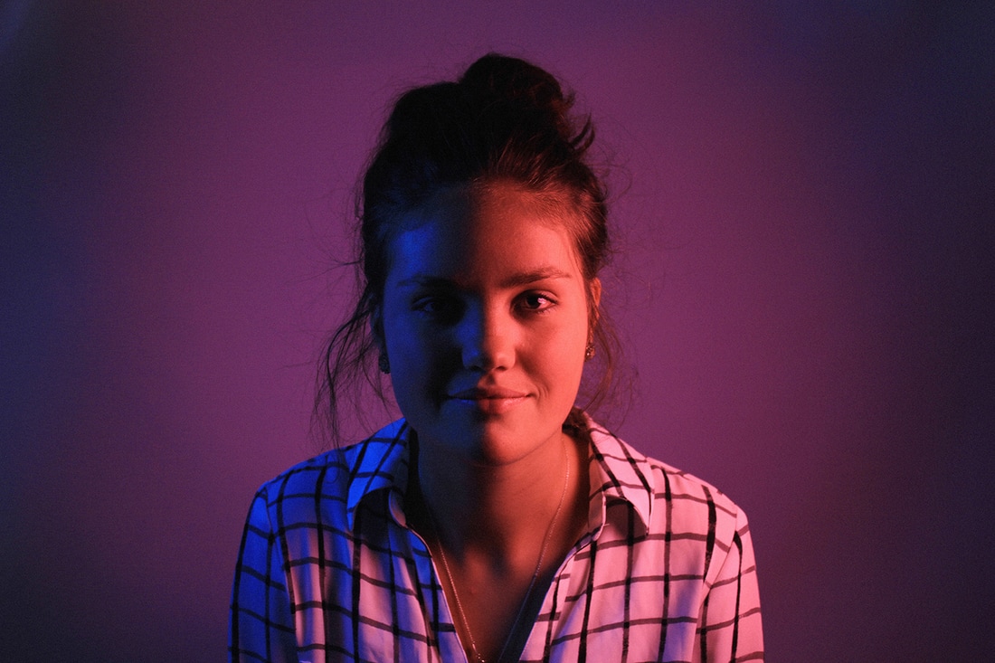 this example, for me, was super helpful for future projects, because I had never used colored lights before. the key is to get good tissue paper. any red tissue paper should be fine, but if you want to have blue light, opt for a darker blue versus a lighter blue. the lighter blue will look too natural compared to the strong red color and cause problems in the background. unlike the example setup, we just had two lights (one on each side of the model) and shot them directly like that. this was due to lack of materials, but the pictures turned out well anyway, so I don't count it as a loss. I do wish that we had used a brighter light with the blue tissue paper to brighten her face however.
|
author17. aries archives
May 2017
categories |
 RSS Feed
