chase zalewski is easily up there as one of my favorite photographers of all time (along with ella weisskamp and allin skiba) due to his attention to detail and use of color. I like that all of his images look like a memory, and are taken with such precision that it somehow manages to capture a decisive moment.
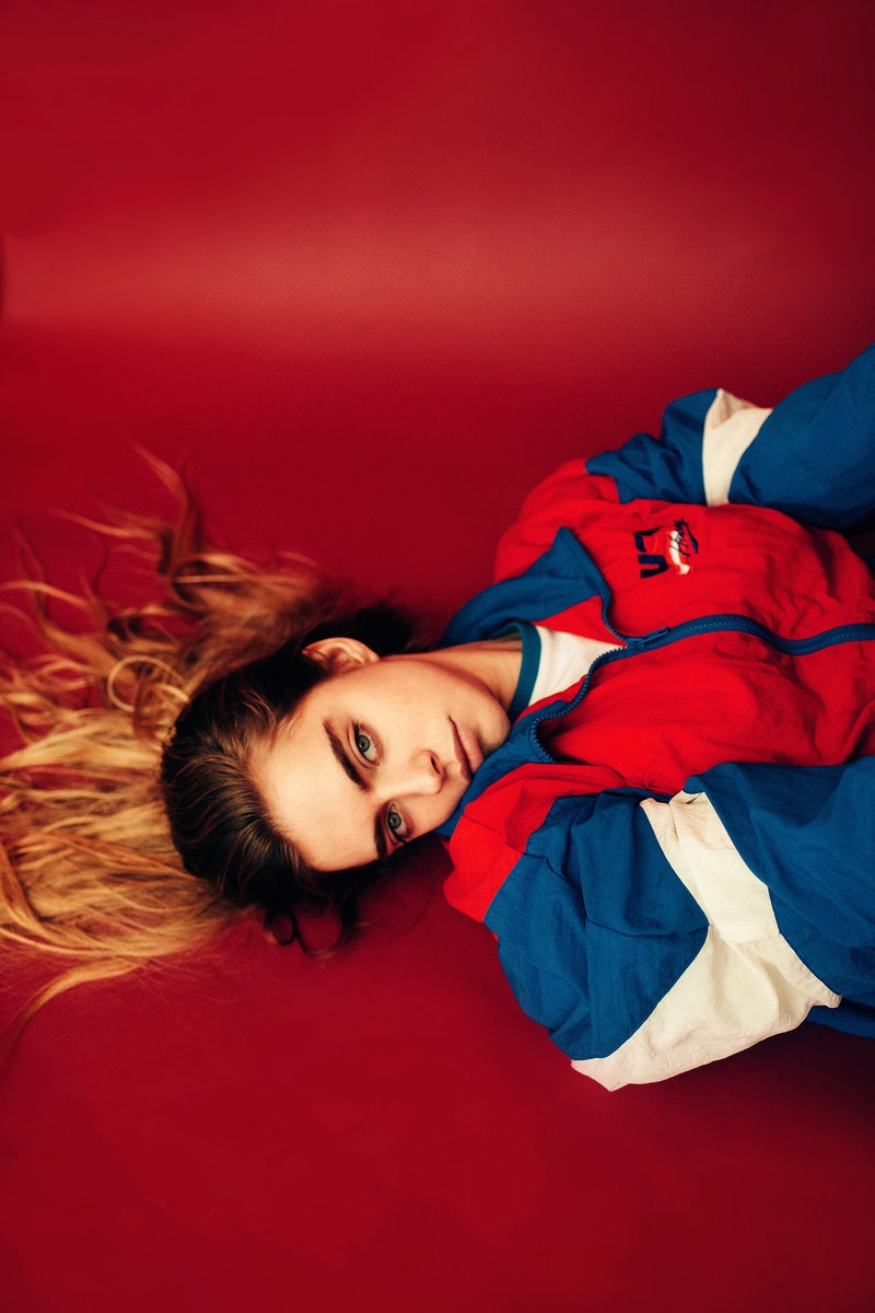
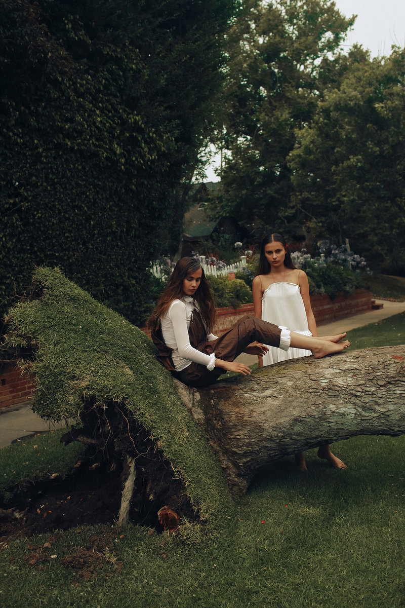
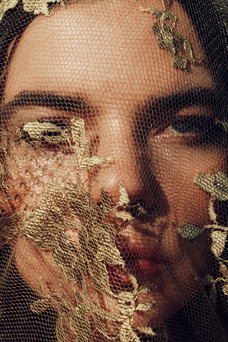
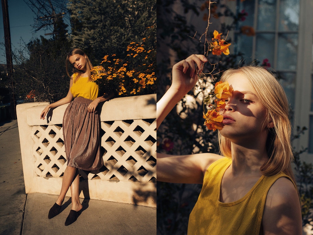
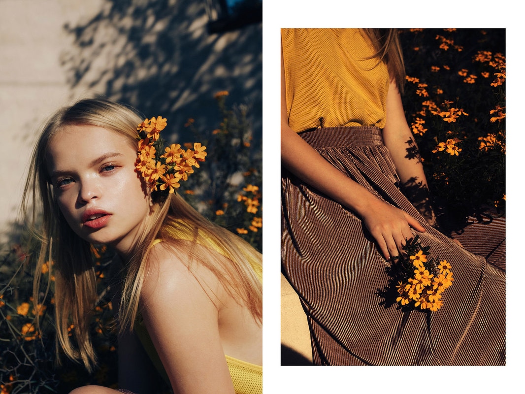
the red photo at the top left is from a shoot with model Marta. the pairing of her stern, brooding look and the bold red and blue colors of the photo add mood and depth to the photograph. he fills the frame expertly and uniquely with her position on the floor, and all lines of her jacket lead to her face and hair, creating a strong focal point. the highlight in the red background adds value to the photograph, expressing the idea that she is on the floor and not suspended in red space. the middle photograph of the two girls was shot with models Olivia and Madeline Magruder. Again, he uses facial expression and body placement to add mood to the photograph. the earthy tones add a naturalistic feel to the picture and the placement of the tree and shrub add leading lines as helpers in the unity of the photograph. the subtle pops of brown and white color add movement of the eye around the composition and it all flows as a color scheme very well. the top right picture was from a small shoot with Alina Aliluykina. what really brings this photograph together is his attention to detail throughout the composition. from the placement of the lace, embroidered netting to the attention to color and mood, he creates a very simple photo with complex detail. the simple variation in the photograph adds a lot of movement throughout the composition, and the color continuity unifies all of the emphases. the entirety of the bottom row is from my favorite editorial So It Goes by Zalewski for Cake Magazine, with freedom model Nastya Siten. this is my favorite series mostly because of composition and color continuity. i love the use of flowers as a prop (huge inspo!) and Nastya's expression/glowy features throughout the shoot, not to mention the lighting is amazing. the light used is obviously ambient with a rich amber hue to it, which helps the color continuity and mood. i also really like the speckled light in the middle two photograph because it adds complexity and unifies the picture together.
0 Comments
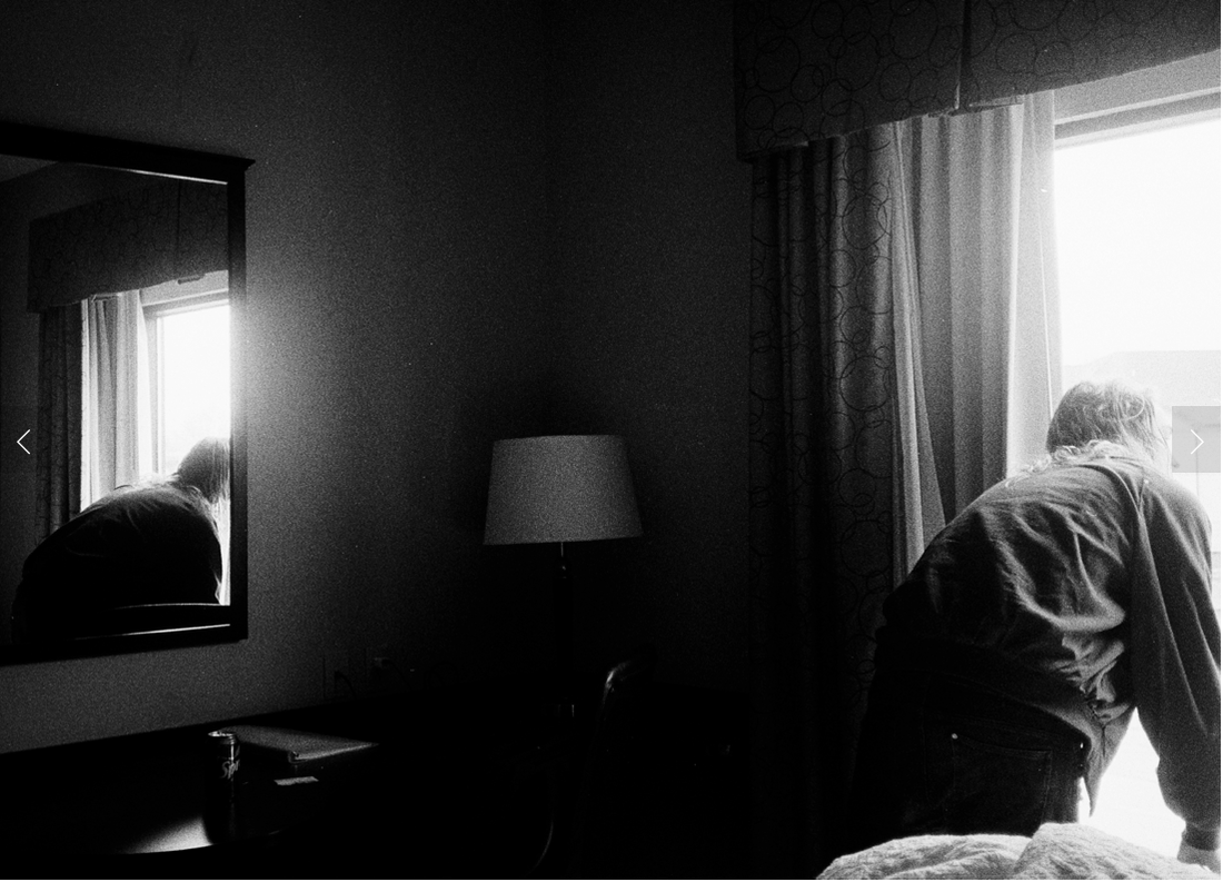
Lighting Example 46: Dramatic LightingExample on Website: 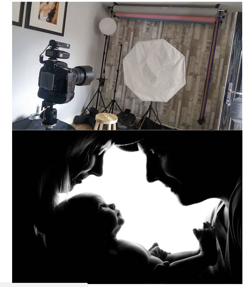 Our Attempts: 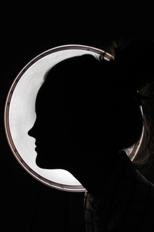 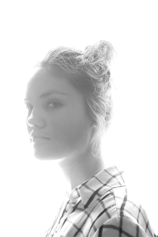 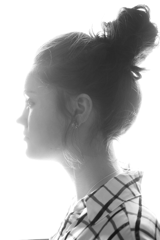 process of this image: this lighting example was quite challenging for us in terms of finding the correct materials and room for setup. the first two images on the right were as close as we could get to the proper set up we saw in the picture, but the outcome was, while not unsatisfactory, did not complete the task, so we had to start over. the photo on the left was an improvisation thought of by chloe. we had maddie stand in front of the light and we shot directly into the light using a low shutter speed to capture a silhouette. the only problem is that the light isn't as large as we wanted, so there's empty space surrounding the light, but it's closer to fulfilling the prompt than the first attempt. Lighting Example 17: Colored LightsExample on Website: 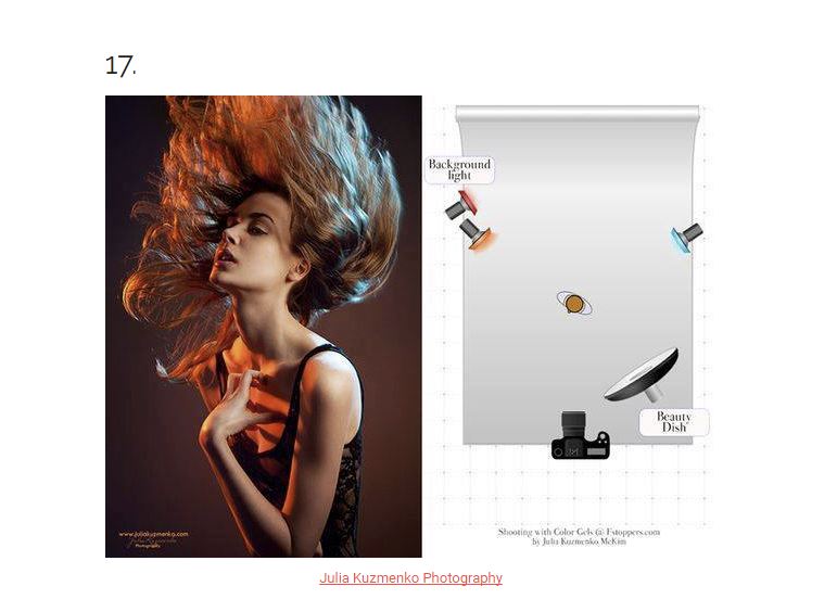 Our Attempts: 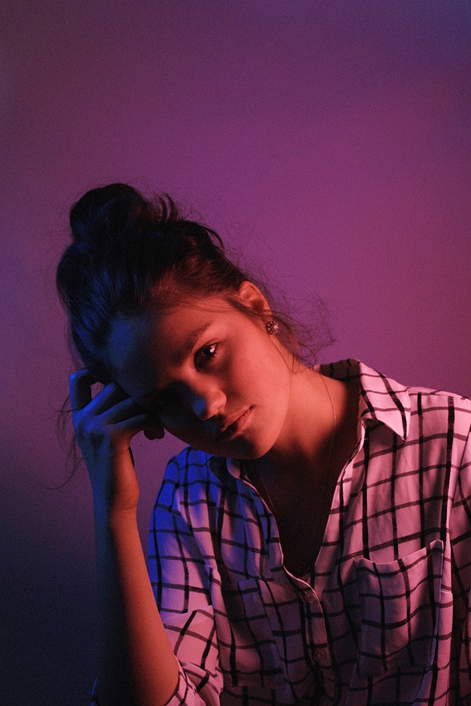 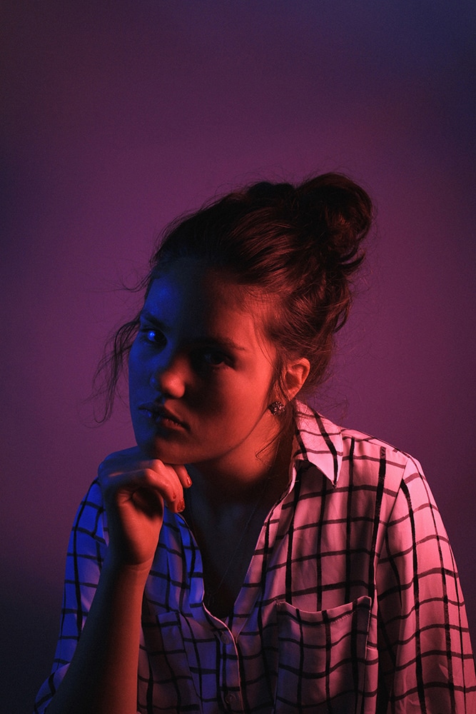 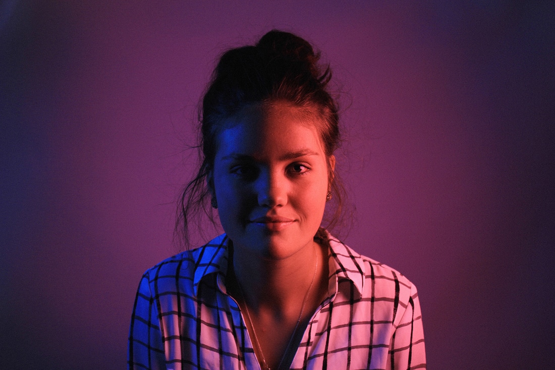 this example, for me, was super helpful for future projects, because I had never used colored lights before. the key is to get good tissue paper. any red tissue paper should be fine, but if you want to have blue light, opt for a darker blue versus a lighter blue. the lighter blue will look too natural compared to the strong red color and cause problems in the background. unlike the example setup, we just had two lights (one on each side of the model) and shot them directly like that. this was due to lack of materials, but the pictures turned out well anyway, so I don't count it as a loss. I do wish that we had used a brighter light with the blue tissue paper to brighten her face however.
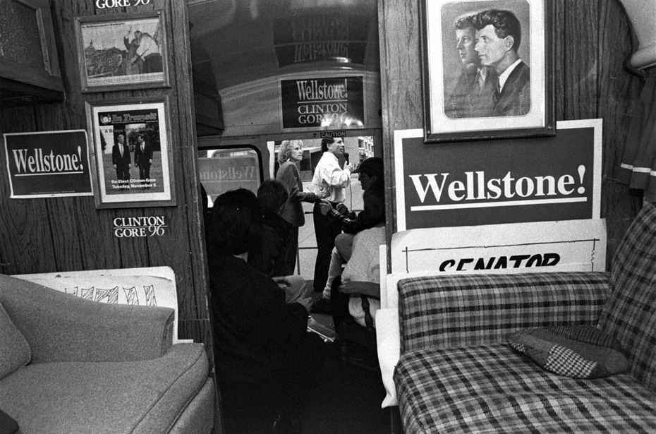
Personally, I think that Terry Gydesen is one of my favorite street photographers. I really enjoy her eye for important candid moments and perfectly timed emotion. Her photographs usually contain space and value to create variety and movement and really heighten the emotion present in the photograph. She's very successful in filling the space she is provided with, and gives interesting perspective to celebrated people and politicians. I find that the tone she uses with the majority of her photographs is what makes them successful, again adding an interesting unbiased perspective.
Lee Friedlander is known for his simple capturings of daily life in the city; the people, the attractions, the buildings. All of which contain elements of artistic purpose: leading lines attract the eye to the focal points of each photograph, and balance keeps the viewer interested.
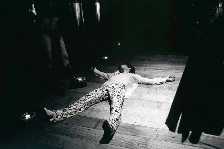
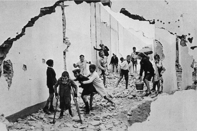
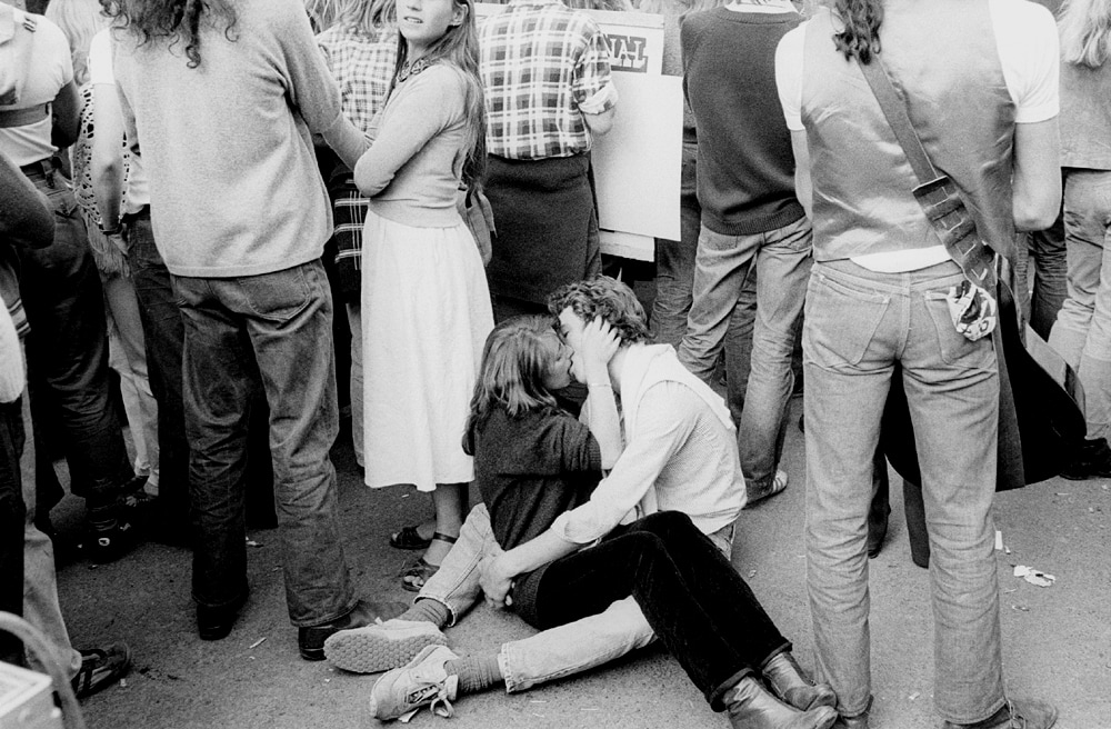
I really enjoy these photographs because they often times are taken from outside a narrative; an outsider's point of view. It adds more meaning to the photographs as whole, and compliments Friedlander's style and intention with his work. What initially drew me to Henri Cartier-Bresson was the famous 'kissing sailor' photograph from the end of WWII. I appreciate Cartier-Bresson's eye for perfectly timed--and candid--shots of passersby in the streets. The focal point of most of his photographs appear to be in the direct center of the photograph, while also keeping rule-of-thirds, even in the most subtle and back-burner way as possible. The high contrast of light and dark tones in the photograph adds a crispness and sharpness to the pictures, which I highly enjoy in black and white work. Cartier-Bresson displays a wide variety of artistic skill in all of his photographs, including his great use of filling space and using leading lines to move the eye.
All of Cartier-Bresson's work captures not only the subjects perfectly, but their emotions as well. The far left photograph depicts the playfulness and harsh ways of children, the middle showing a feeling of melancholy and disruption in a soft way, and the far right captures the passionate emotion of spontaneous young love.
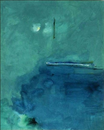
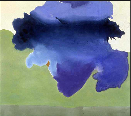
helen frakenthaler's contentment island
describe: mixture of green and blue cool colors; areas of extreme dark and extreme light; brush strokes evident in some areas; focal point seems to be either the green vertical line or the white/yellow spot analyze: lines move eye from green vertical to multicolor horizontal and into the dark blue pool; almost looks like water drops on some areas of the work; moves eye to some extent; the coolness of the smaller blue area balances with the slightly warm larger turquoise area. interpret: even without looking at the title, the image seems to be somewhat ocean related, almost like a boat on the sea or an ocean-scape. the mood is nostalgic and melancholy, yet at ease; like she's painting a past memory she can barely remember anymore. evaluate: personally, i wouldn't pay $18,500 for this piece of art, but i can see where someone would like it. i guess it would seem more impressive in person in its original size.
first seven are allin skiba [www.allinskiba.com]
middle row of 6 portraits is megan niger [www.meganniger.com] last six are edward weston
edward weston
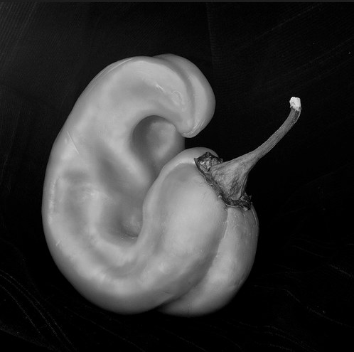
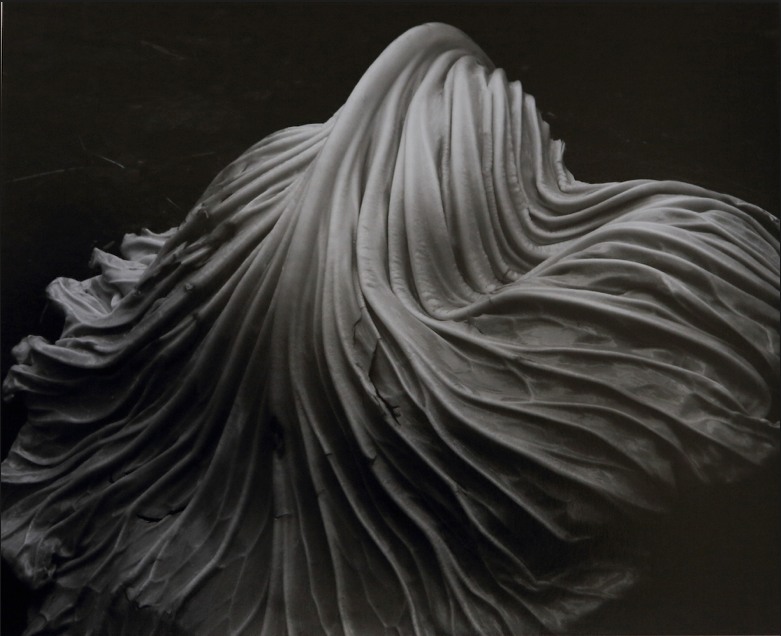
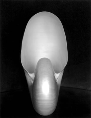
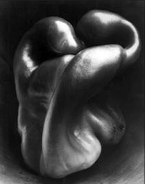
edward weston was born on march 24th 1886 and died on january 1st 1958, leaving him 71 years. For around 40 of them, he dedicated to making photographs, only to stop taking pictures in 1947 due to his later developed parkinson's disease (he continued to develop his negatives after that). weston did attend an art school, but he dropped out early after he finished all of the course work in 6 months and refused to pay the rest of the 9 month course. He then moved back to California (as he had been there previously before he went back to his birth state for schooling) to fully pursue his dream. He published many of his works after that time, his pepper and cabbage photographs being the most popular, until his death in 1958. personally, edward weston is one of my favorite photographers solely for his pictures of vegetables. i like his work because it causes eye movement, has dramatic lighting and great composition, but i especially like his work because he choses to do more with, lets say a pepper, than any other artist. he seems to choose his subject based off of the human body (like pictures 2 and 3 above suggest). the way the peppers grow makes me think that it reminds him of the human body, and photographs it as such. weston almost makes the pictures romantic by creating a mood with the lighting/position of the pepper. |
author17. aries archives
May 2017
categories |


 RSS Feed
